Ligne
Interior design for a New York City apartment
The House Interiors
Hosted by Archdais, 2020
Top 50 entries

The competition called to design the interiors of an apartment in a location and the style of our choosing. I took a mid century modern approach with sleek lines and a minimal palette to reflect the fast life of the context, New York City.

F L O O R P L A N
1. Foyer
2. Living room
3. Open kitchen + Dining
4. Home office
5. Powder room
6. Storage
7 & 8. Guest bedroom + bath
9. Terrace
10 & 11. Master bedroom + bath
12. Balcony
13 & 14. Child's bedroom + bath
The floor plan invited a lot of natural light which was further enhanced with the use of light coloured materials. The division between the living area and kitchen was broken down to follow an open floor plan. Not only does this maximize the space usage, but in turn allows a relay of conversation to bond during family gatherings.
The other spaces, though separated by walls, have a common language in some form or the other.

M A T E R I A L B O A R D
Uninhibited expression of every material used makes up this neutral colour palette.

Stepping into the foyer of the apartment, the idea was to create an experience of freedom, movement from a closed to an open space. Representing the joy of coming back to a place of relaxation from the bustling city. The mirror is pivotal in serving multiple functions- to brighten up the space and a final chance to perfect that look before leaving the apartment.

As part of the open plan, the living room shares its space with the dining and kitchen space. This meant the design of the three had to be cohesive. The dual finished wall along with the floor and ceiling run uniformly from the foyer. Large French doors and a glass brick bathe the space with natural light during the day and a wonderful view of the city at night. Also a space for entertaining, a dropdown projector over the French door and the curtains drawn, perfect to catch the NYC matinee right here.
A wide use of indoor plants and the overall essence of nature is a big play in adding a tropical touch to a mid century modern styled apartment. A marble panther and a 70's inspired golden palm lamp is a contrast to the Sofa 280, mushroom lamp and vintage lounge chairs. The shelves are dotted with an eclectic collection of ceramics and objet d'arts along with lots of coffee table books. A marble coffee table and platform add a sense of opulence.

The concept for the kitchen was to be open and free flowing. Embracing natural textures using dual tones gives a sense of versatility. The wooden texture brings warmth and a feeling of lightness which is complimented by a white marble countertop. This binds the kitchen and the living space. Small square footage calls for smart usage of space, which means storage design is vital. Safe to say it is a drawer free kitchen.
The breakfast counter is a great space for multiple activities; breakfast, homework or just a space to lounge. A large painting by a local artist takes the space to another level. If a piece of art can't be viewed entirely, it is being lived.

The home office serves as a place for inspiration, focus and quick power-naps. A large mirror enlarges the space which reflects a wall of replicas from Matisse's Blue Nude series. A shelf of artifacts and books serves as a pierced screen.
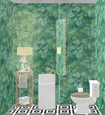
The powder room is a rule breaker. The experience created was to be like walking into the belly of the Amazon, hoping to not get attacked in a state so vulnerable- on the pot. The brass fixtures, patterned tiles and wooden furniture against the foliage wallpaper is a play on contrasts while also representing abundance and royalty.


The guest suite uses brick as an experimental accent. Terracotta is a nice colorful pop in a gray and white apartment. It gives a robust and industrially warming feeling too.

A crowded city like New York can sometimes be overwhelming and a little escapism is what was to be achieved. From Sunday brunches to after work relaxations, a green oasis is what most homes lack in New York. It was an addition that the home really needed.
Lush green planters out of sculptures is a great way to showcase outdoor art. An outdoor mirror is an amazing way to elude a large terrace. A great space to spend cold nights with a fire burning as well under the summer sunshine.


The master suite reflects the extensively used neutral palette with materials like pine wood and simple white plaster walls. The primary focus is to just rest easy and not have anything overbearing. Relaxation is the key emotion of this space that then leads to a bathroom adapted for long drawn bathrooms. The concrete texture used has been given a darker tone accentuated further with an adjustable warm light that turns the space into a sauna.


The child's bedroom requires a well designed organizational system only because of the sheer amount of things a child during their growth. Low lying shelves store away hampers of toys, stationery and other knick knacks away. The furniture was designed considering the height of the child so she can easily grab things and create levels to add a touch of adventure. This is the only room with colour on the walls- a princess pink.
The bathroom uses diamond shaped glass tiles which shimmer against the light, to mimic the glass castle fantasy. Brass fixtures elevate it further.
Next up: Mokhoro

©2025 Theertha Shetty